|
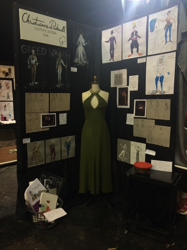
May marks the beginning of finals, graduation parties, and for most arts students, portfolio reviews/shows. Over the past three years I have picked up a few tips and tricks for creating a cohesive and inviting display that I thought I would condense into five tips this month. I just finished my fifth portfolio review of my graduate career with one more this fall and "the big one" coming next January. Since it is the season we think of getting our work out there, here are five tips to helping you have a professional portfolio set up. 1. Keep your fonts in the same family When printing out your resume, business cards, notations for projects, name plate, etc. make sure your fonts have a dialogue together. For example if you take a look at my resume you will see my name and title sections are in the same family as the titles for my online portfolio. The body of my resume is a different font entirely, but the two fonts do not draw attention over each other. I like the look of a serif paired with a sans serif, but it is up to you. Font.com has a nice short article to help you pick which you like best. If you choose to mix your two fonts like I did, make sure you keep them organized. I like to make my serif font titles, headers, etc. while a sans serif is good for the body of a section. Don't feel like you need to mix fonts though. This entire blog is a serif and easily readable. Pro tip: NEVER use Comic Sans. Just don't. 2. Don't create a still life People have come to see your work and as you questions about your process. It becomes hard for them to do so if you lay out your work in a way that does not invite rummaging through your sketches or swatches. Organize your work in binders or hang up pieces that you want to be viewed a certain way. You can also lay out pieces loose leaf, but be prepared to have them move around your table a bit. I tend to put out little plaques that keep the table divided into sections without creating physical dividers. People want to look at your work. Let them. 3. Have a clean background for your work I use black fabric tablecloths to hang over my tables and board if it is not black already. This creates a clean surface for my designs to shine on top of. Those looking at my portfolio are not distracted by a crazy colorful background because the black does not compete with my designs. Sometimes a design in your background can work well if you have a well planned out theme and keep the color neutral. Color competes with your work. 4. Have an editor Have a trusted friend or colleague read through any of your written material before printing, mounting, etc. Apps such as Grammarly or Ginger (nybookeditors.com has a list here) can also be helpful before putting out your work for all to see. 5. Create a focal point of your display When setting up my portfolios I always try to create movement for the viewers. You tell stories with your design, try to tell a story with your display. For one portfolio I showed my design process for three characters of a recent play I designed that went through five or so redesigns. This was a really interesting way to present how I work to my audience. Another time I created a color collage with photos from the designed show and renderings. The color drew the eye first to the collage and then allowed the viewer to explore the rest of my display after quickly learning what it was about.
1 Comment
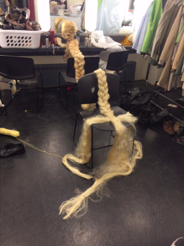
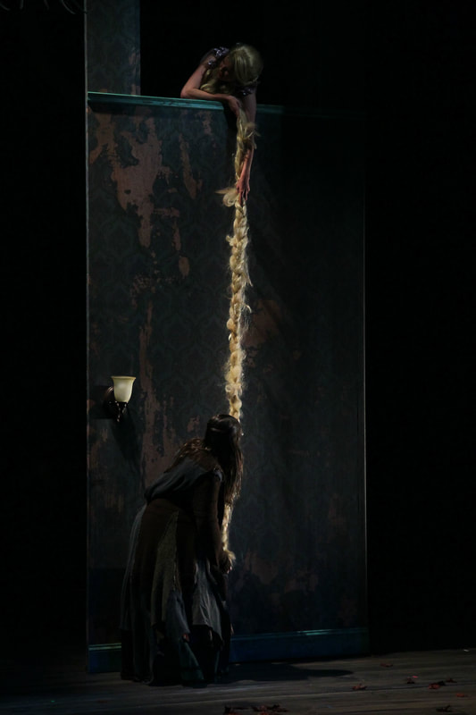
My blog this month is a little later because I have been gearing up for my year end portfolio review and part one of my thesis jury. This semester as part of my thesis I had an internship with the designer Mio Guberinic which I have mentioned before here. As part of my internship I worked with Mio on a production of Into the Woods at Princeton University. It was a lot of fun to assist on a musical, which I have never done before. It was also nice to take a break from my university and help on a production in a totally different academic setting. I did a lot of paperwork for the show, so now I am a wiz at Google/Sheets and similar programs like Excel. Now at the Rutgers costume shop I am call on for any computer paperwork question which is fun. I oddly find Excel spread sheets beautiful and rather satisfying when making conditional formatting, etc. One of our professors joked I should teach a master class on "How to Use Excel in the Costume Shop". In addition to the paperwork I also worked closely with the wigs; mainly Rapunzel's wig. I also styled the Witch and one of the Step Sisters as well. It was a lot of fun to get back to wig designing since I have been away from it for a few months. Rapunzel's wig was quite the challenge as it is so iconic (the length at least). The wig also needs to be "cut" twice on stage in different ways which was my main task to fix. I ended up creating a pull away piece that was just loosely braided into the longer section of braid for the first "cut", and created an attachment at the nape of the wig that was easily unclasped for the second "cut". I'm making it seem simple, but the task was pretty daunting in the beginning. I was given many small sections of loose hair to create the iconic Rapunzel braid. After two test runs of 15.5 ft braid, we had it ready.
This is just a snapshot of what I have been up to and why my posts are so infrequent. I have had a great time working on this production and hope to work with Mio and the lovely people in Princeton again in the future.
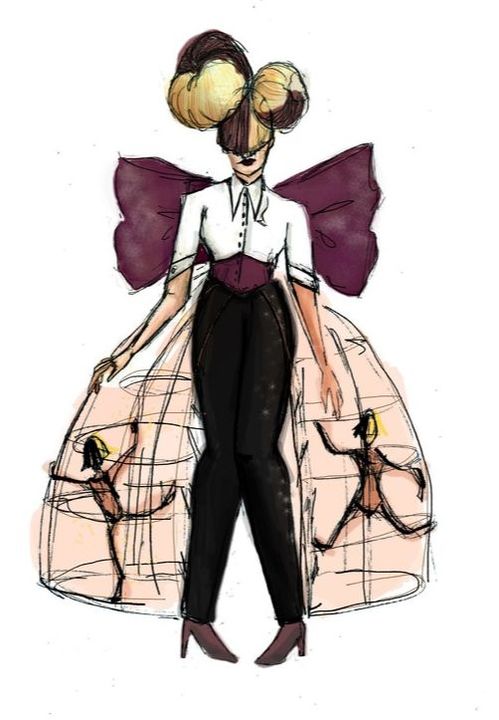
Now back to my thesis prep. Five year goals, relationship goals, "squad goals" (what does that even mean?). All important to someone, somewhere, but not the goals I try to use in my designs. The other week I was speaking with some of the BFAs in the program here at Rutgers about their work. The designs and renderings were beautiful but they were worried about presenting them to their class. I asked why they had chosen certain things and they responded. "See. Easy," I said, "those were your goals for the project. Speak about them." I always try to have one or two goals for a project that I can point to when discussing my work. I try to think of a very specific thing in the performance I would like to accomplish through my design and work around that central point. What is the main view point of the director/production/artist? Can my goal work off of that more specifically? For example, in our Costume Rendering class a project (the project the undergrads were working on too) was to create a changeable look for a pop artist. The artist I chose was Sia. There are many reasons why I chose Sia, but the main one is her concerts tend to be more a performance piece. She has other artists share their talents as well. In "Nostalgic for the Present" she remains fixed to a spot that is pivoted around the stage while Maddie and her other dancers interact with video and each other. Something about the performance art aspect of her show drew me in. I had GOALS for this project. Two very specific items:
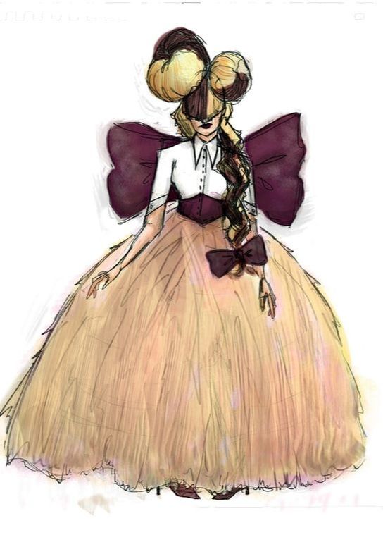
If you look closely you'll notice Sia's hair changes from first to second look. In my third look the two buns disappear to reveal a short angled pixie that still hides her face.
GOALS, not something to be afraid of! Except maybe that five year one for after I receive my MFA... Till next time. |